Table 12.
High end home goods made affordable. Equity Brands had quality manufacturing and a price advantage but no brand to carry it. I named the line, built the identity system, and designed packaging that earned shelf space against premium incumbents. Revenue grew 30% in year one.
Equity Brands had the manufacturing relationships and pricing structure to compete with premium home goods, but generic packaging was leaving margin on the shelf. Buyers couldn't tell the line apart from private label.
Affordable doesn't have to look affordable. Quality at a fair price is a story worth telling, but only if the packaging earns the shelf.
How do you give a value-tier brand the design language of a premium one without losing what makes it accessible?
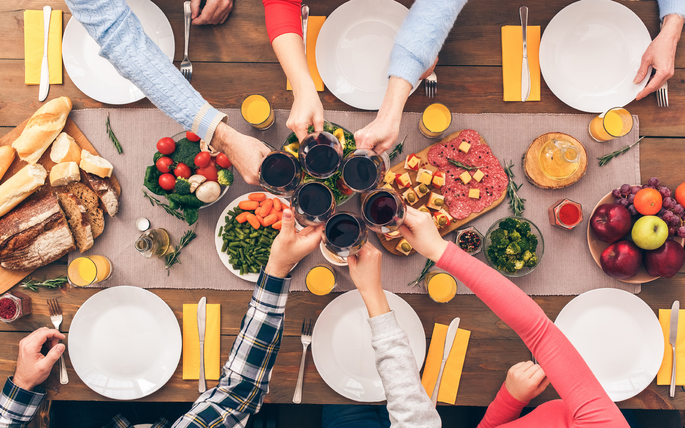
A modern rustic identity. Heritage cues, retail confidence.
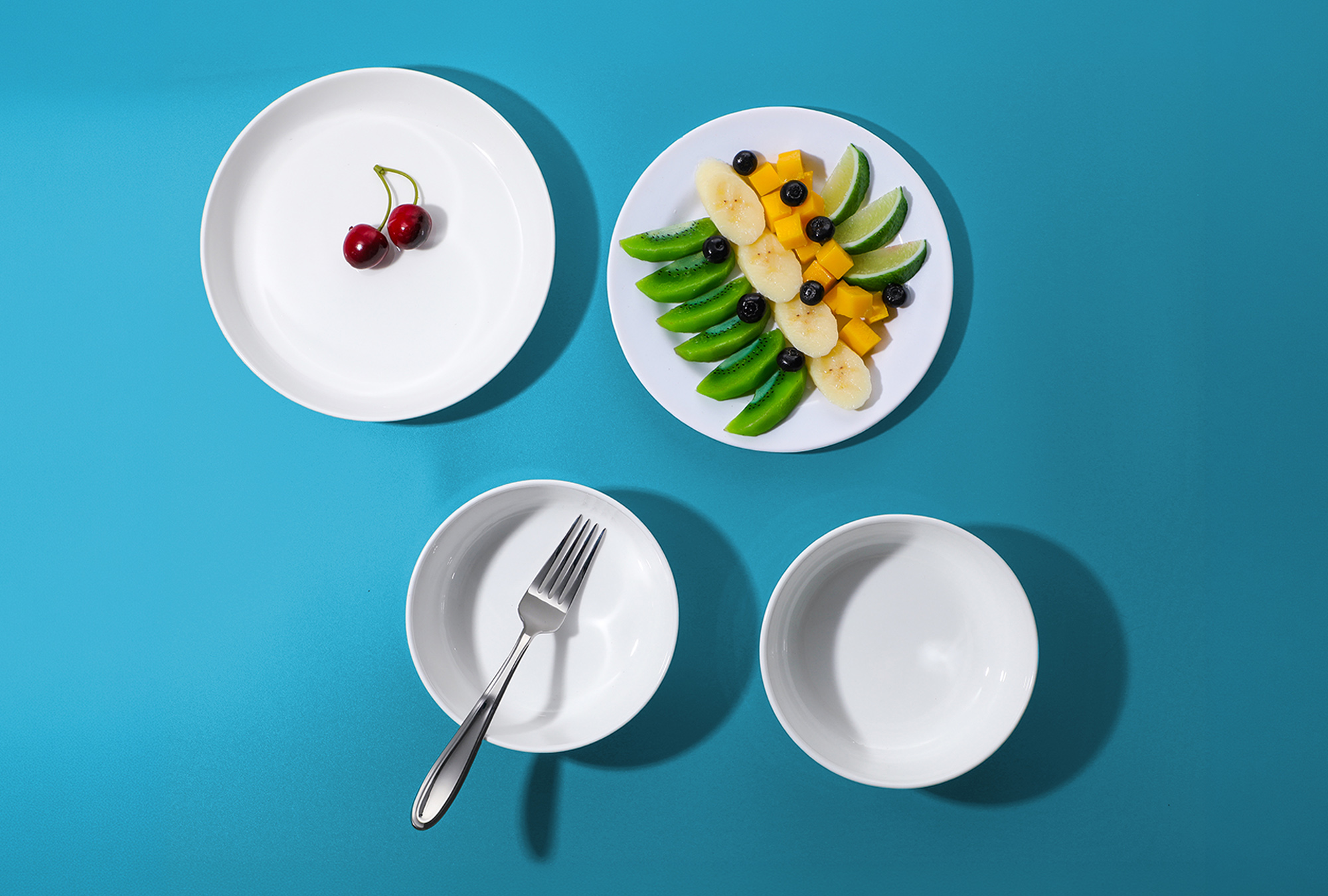
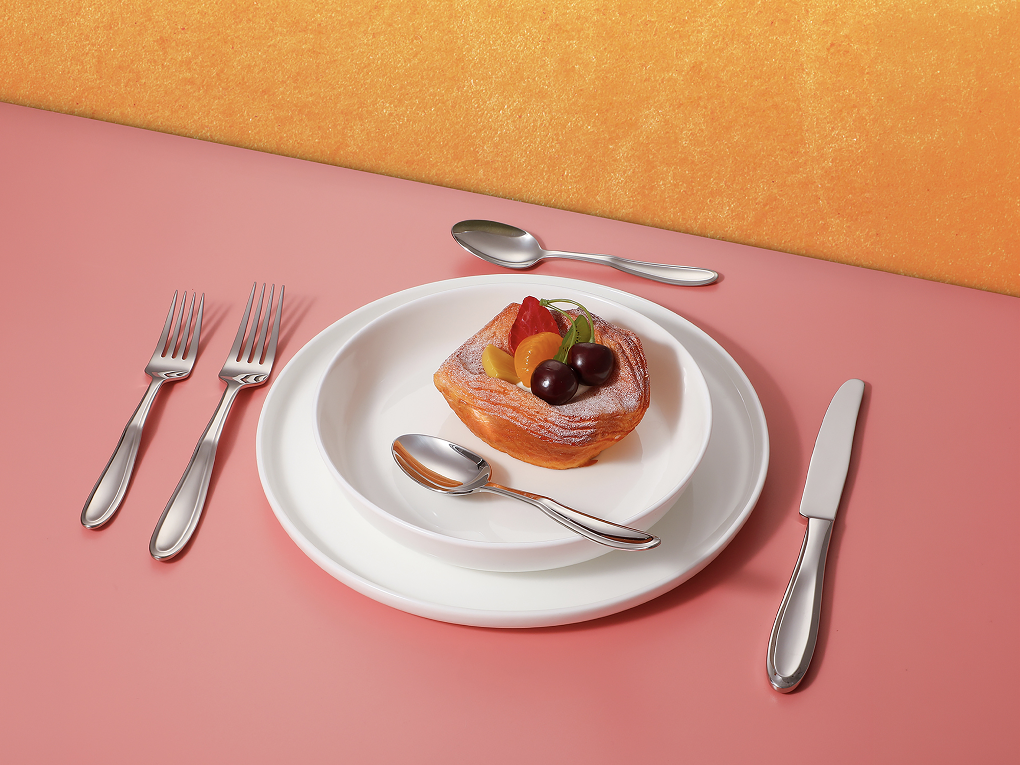
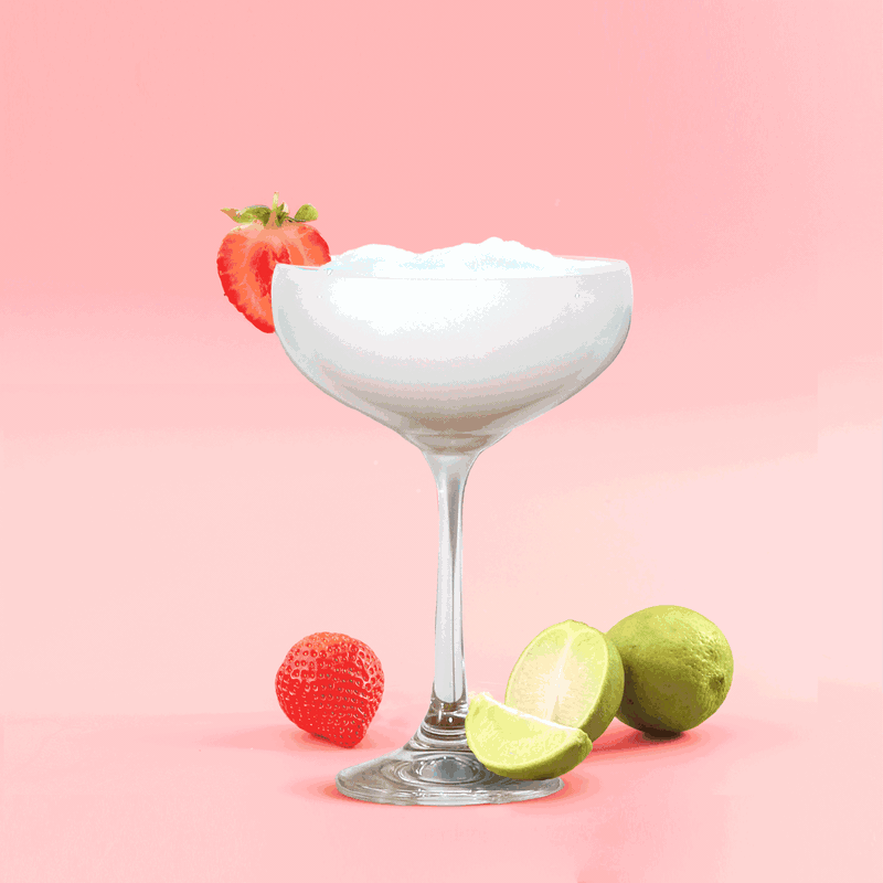
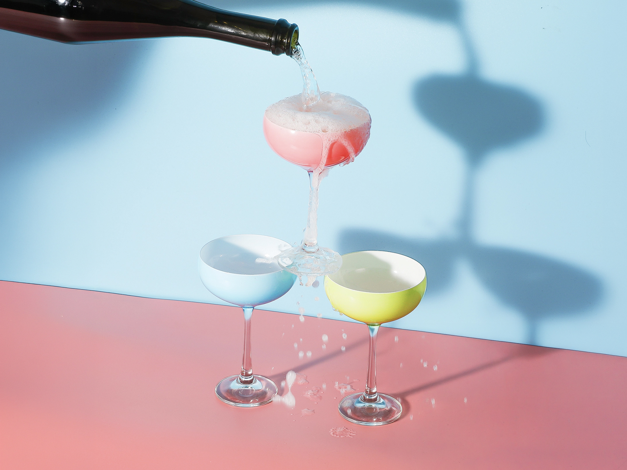
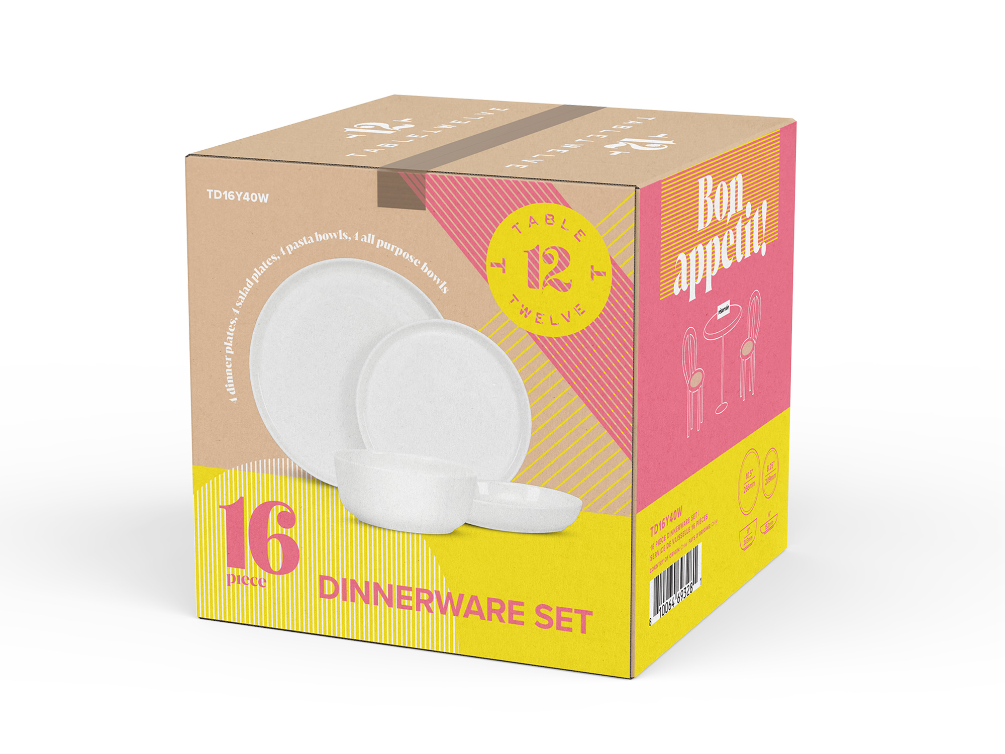
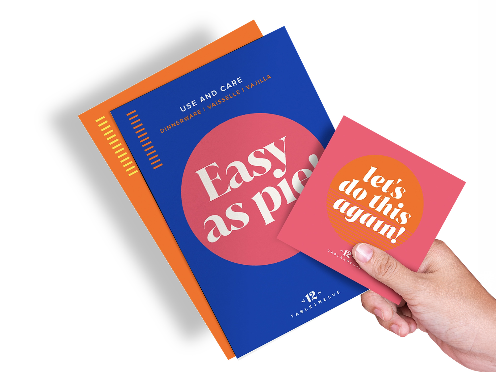
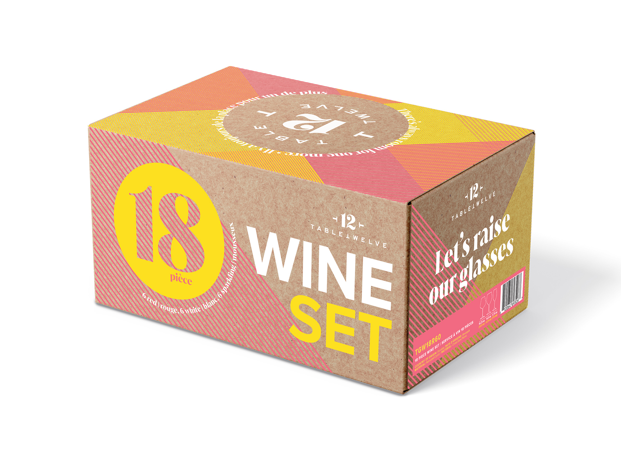
The name Table 12 evokes a gathering, a setting, a place worth showing up to. The identity pairs warm earth tones and serif typography with clean geometric structure, signaling craft without nostalgia. Packaging treats every SKU as an object on display rather than a product on a shelf.
The system extends across dinnerware, glassware, serveware, and seasonal collections, with consistent visual language that gives buyers a reason to commit to floor space.
Identity, packaging, and product world.